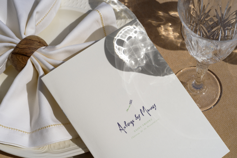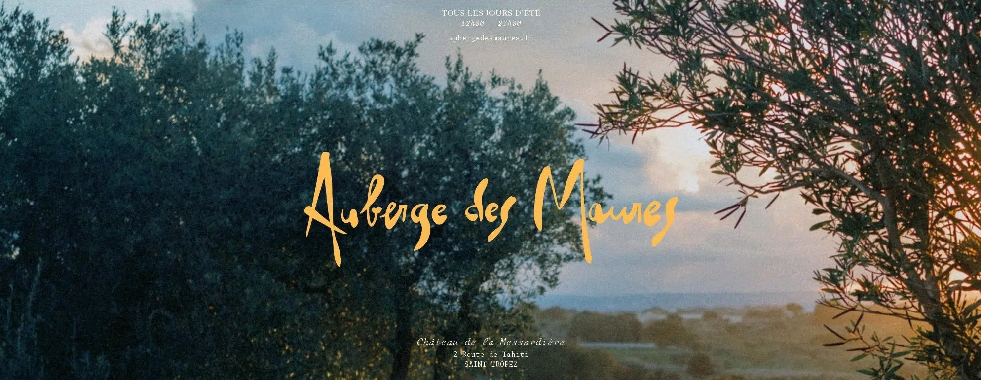
Emblematic French Riviera restaurant l’Auberge des Maures moved to the heights of Saint-Tropez in 2021, settling into the Airelles Group’s palace, le Château de la Messardière. Airelles called upon Creative Supply to update the visual identity of the Auberge des Maures and help them pen this new page of their history.


Cocteau, Colette, Picasso… the guestbook of the Auberge des Maures is filled with its share of stately signatures. The restaurant was originally located in the heart of Saint-Tropez’s mythical old town and was the scene of some of the village’s finest hours. To continue serving its traditional Provençal cuisine to the world’s greats, the Auberge recently took up residence in the Château de la Messardière. Airelles called upon Creative Supply during the transition to help them attract a new clientele and rethink the visual identity of the Auberge des Maures.
Palace (r)evolution
Projects involving a historical heritage such as that of the Auberge des Maures pose a unique set of challenges: highlighting the heritage, bringing it up to date to maintain attractivity, and adding new elements to grow the brand and avoid the “museum effect.” Working on a restaurant like the Auberge des Maures also meant thinking up an identity that would appeal to its long-standing customers, as well as guests and visitors of the Château de la Messardière. Plus, the Auberge’s new identity had to be in keeping with that of both the palace and the Airelles Group.
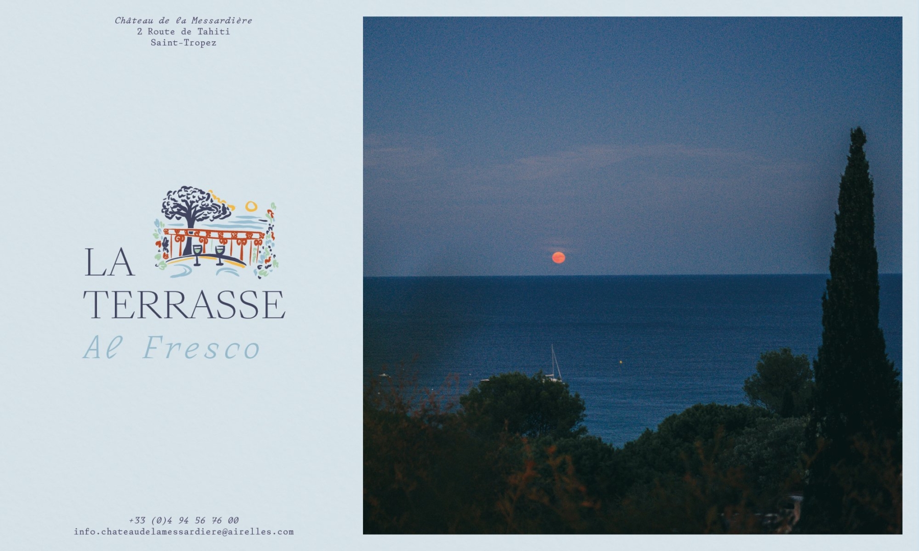

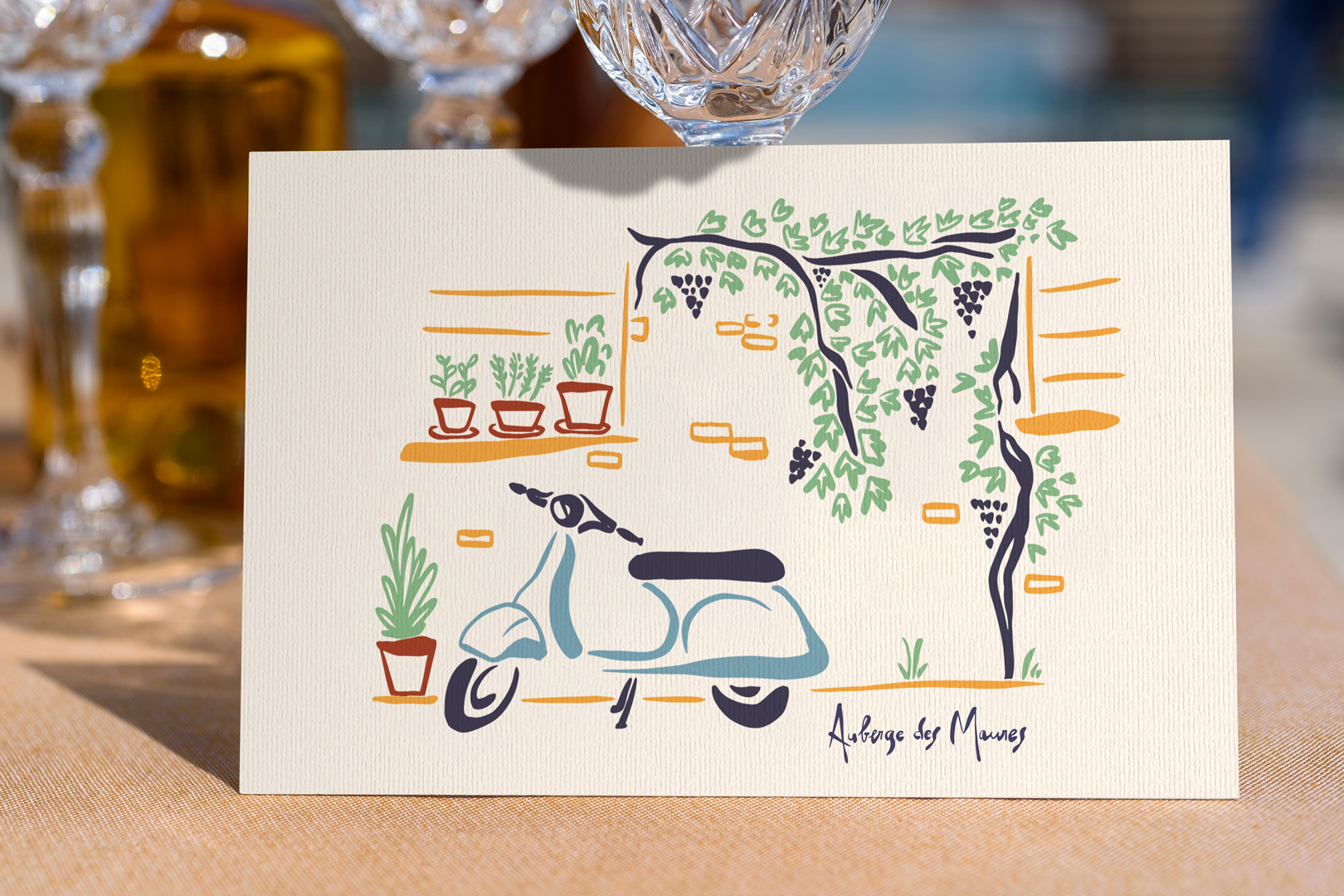
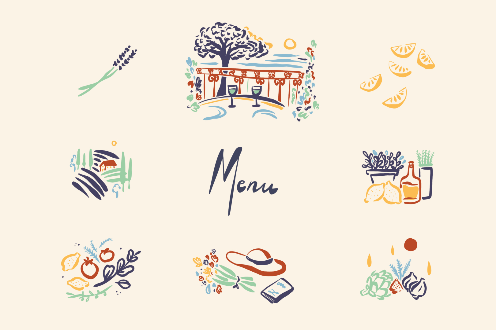
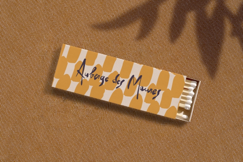
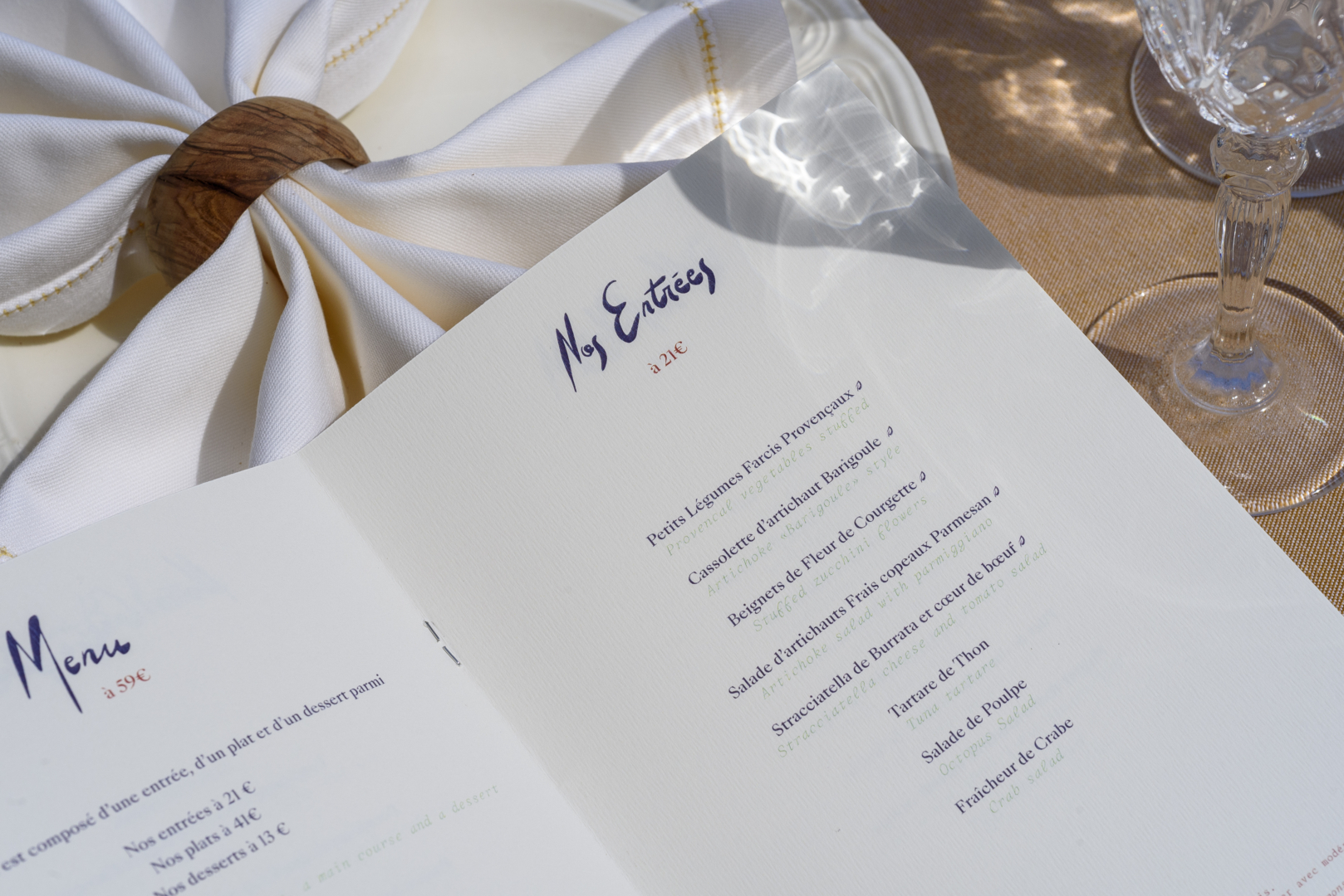
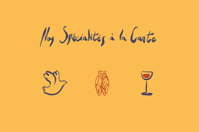
Rather than addressing these imperatives with a mere dusting off, our designers Nelly Damas and Aloïs Ancenay chose a progressive approach to bring colour and life to the new identity. The calligraphic logo and sign show a marked evolution from previous versions: more curves and a lighter feel, with emphasised bolds for warmth. The sprig of lavender and establishment’s address were added as a subtle nod to the brand guidelines of the Airelles Group, and several menu items were calligraphed to ensure a consistent style throughout. Regarding the choice of colours, it was inspired by the Provençal palette (dried lavender, terracotta, almond green) and lightened for an airy touch.
“It was a great pleasure to work with the entire Creative Supply team. I really appreciated their concept, their creativity, and their ability to manage our project from A to Z, with a great attention to detail.”
, Marketing & Digital Director, Airelles
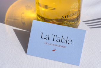
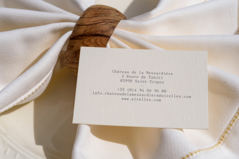
The various applications (menu, postcard, business card) follow the guidelines and have been enhanced by a series of illustrations. Over twenty illustrations were created, including scenes, objects, dishes and motifs. The drawing style resembles that of the logo and the calligraphed titles to ensure consistency here again. The menu layout is sober and elegant, in line with the prestigious venue, while the exuberance of the colours and illustrations offers a strong contrast.
The Auberge des Maures, like the Château de la Messardière, opened its doors in the summer of 2021.