In 2018, brands will get brighter, braver and bolder. We present to you Creative Supply’s view on design trends in 2018!
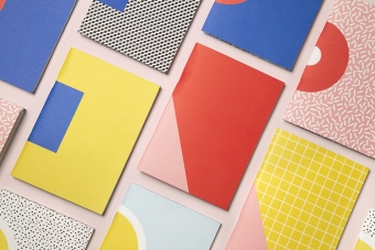
1. Brave new colours
Design-influencing giants Instagram and Spotify reintroduced us to gradients back in 2016. The trend shall live! Use it to compliment flat design, and don’t be afraid of the brightness of colours.
We are still observing a shift from calm pastels to a more lively colour specter. Think Premier League’s rebranding: vivid blocks of colours and simplistic monotone patterns.
According to Pantone Color Institute executive director Leatrice Eisema, metallic trend will remain, although will be toned down (perhaps, to balance out the vivid brightness of gradients?). Iridescence and pearlised effects or translucency will provide more ways to stand out.

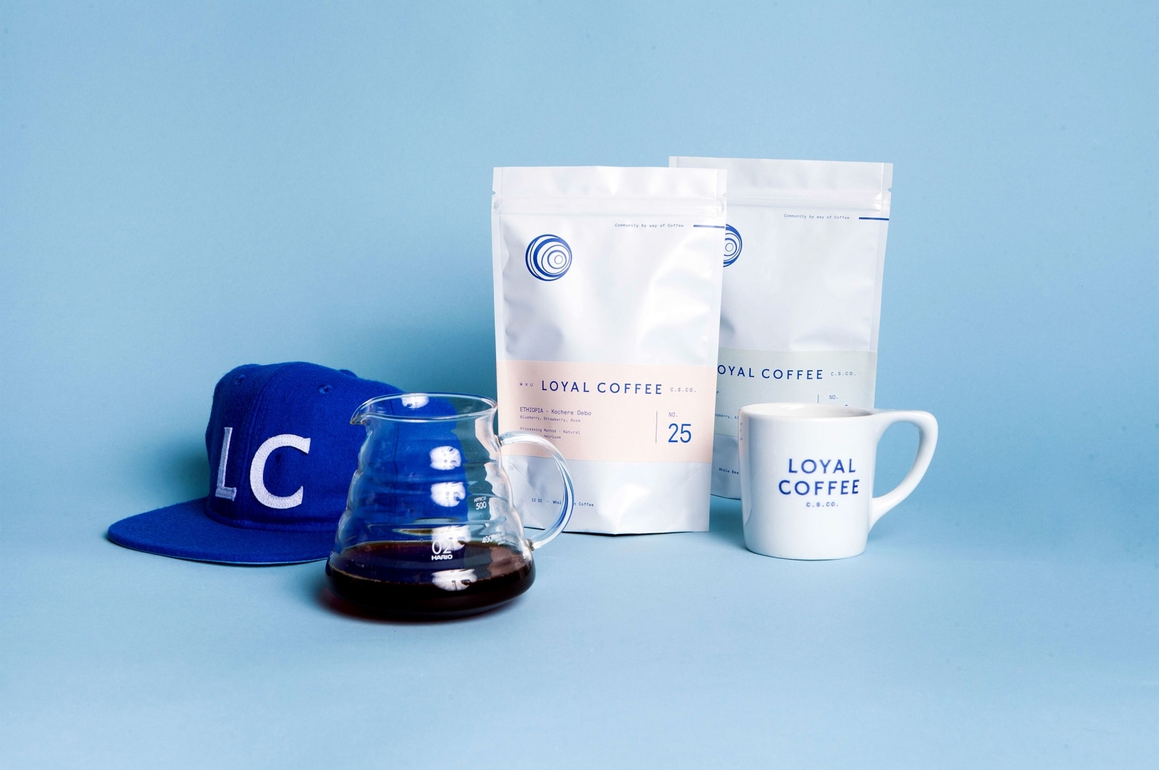
2. Hand written
Creative fonts alone or in combination with a sans serif are expected to be exploited in brand design this year. Take example from an online publishing platform’s Medium redesigned logo: from a minimalist, cold sans serif look to a more personalized typeface. 70s and, perhaps, even 90s style serif fonts will balance out the sterile Helvetica this year. We expect to see more custom font solutions for intenser visual brand expression.
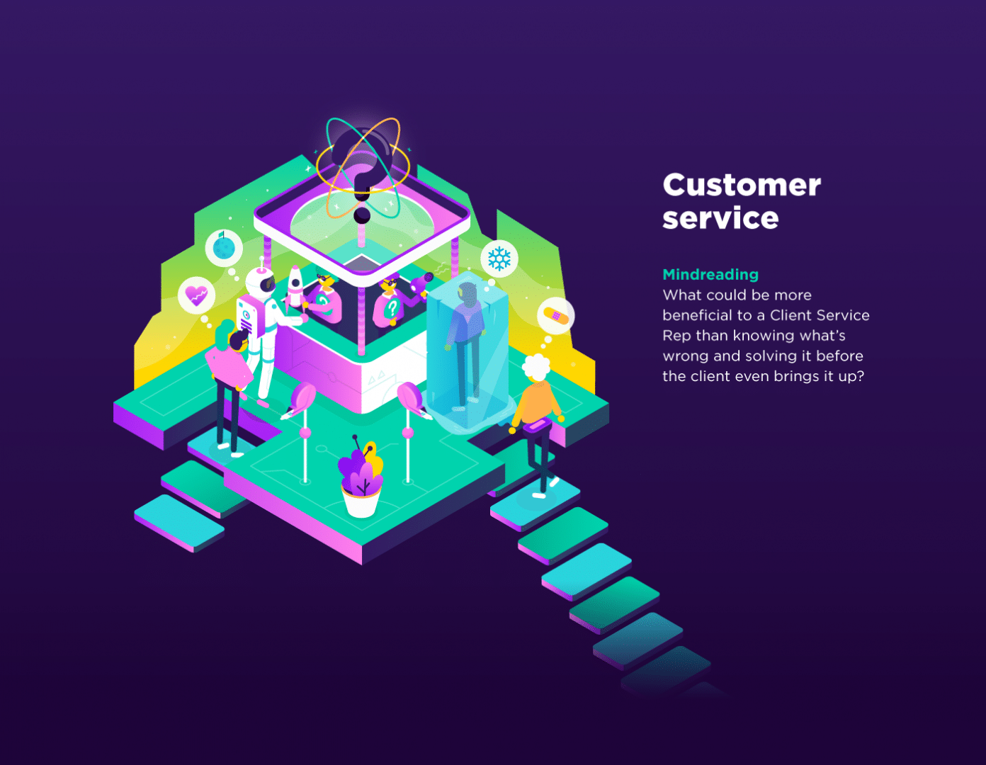
3. Hand drawn
Not only the fonts are getting more personalized, but also the imagery. From 2017’s anti-stock movement, we move further towards the direction of maximized personalization. Illustrations will be dominating brand campaigns his year. From simplistic line art to complex collages, there will be many ways to illustrate a brand in the months to come.
4. Responsive and contextual
For all brand designs, think “smart”. Logos are getting more context. Metaphors will be your friend. A trend that is not new in design will only grow stronger this year. When designing a new logo, ask yourself if there is any witty way to portray it? If there is an opportunity to play with words, meanings and underlying contexts, grab it!
Brands are expected to demonstrate a deep understanding of the different context in which the designs are applied. From different screen sizes to a range of collateral, the brand design has to remain flexible although still strongly recognisable.
5. Creative content
While expressiveness is encouraged across all visual aspects of the brand, a growing number of mobile users continues demanding to strip down websites to a bare minimum. See it as an opportunity to focus on what truly matters: the thumb-stopping content. The necessity for a reduced amount of text should be substituted with bolder, shorter wording and eye-catching visuals. With viewer words, create stronger impact. Focus on creative content!
6. Stick out
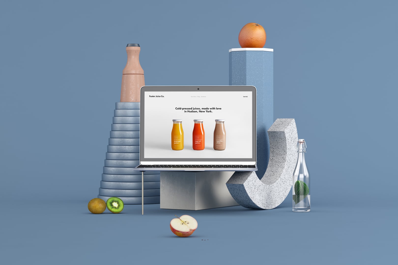
3D typography and 3D designs. So real-looking you feel like you could touch them. A trend that originated from e-commerce. This year, turn your visuals digitally tactile and absolutely mesmerizing. The designs by ILOVEDUST should set a bar for your brand’s creative typography, and your product should be shown off in no other way than On’s running shoes: rotating, realistic and interactive.
If you would like to share your opinion on the article, drop a line to Youri at youri@creativesupply.com